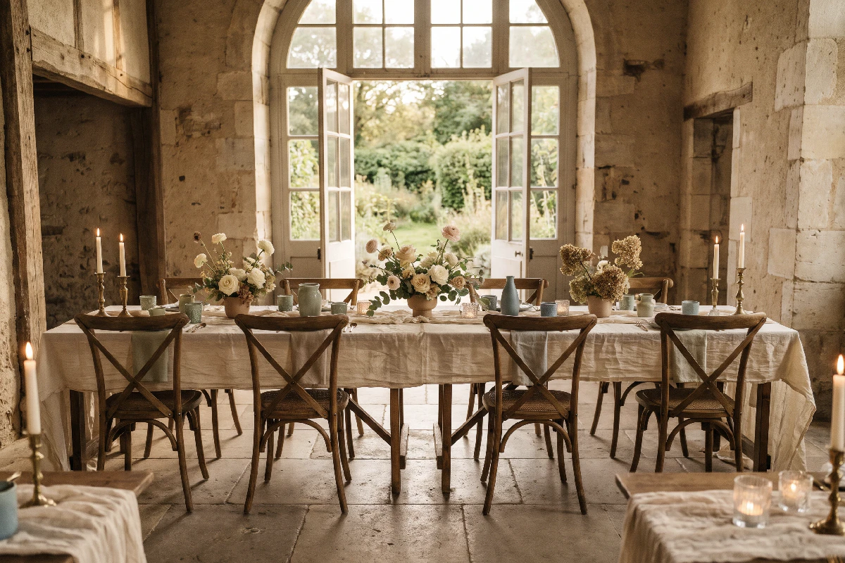
The Influence of your Wedding Venue Color Palette
The colors you love are only part of the picture. Your venue’s architecture, materials, and lighting all shape how a wedding palette looks and feels. Before choosing your shades, take a closer look at the space where everything will come together.
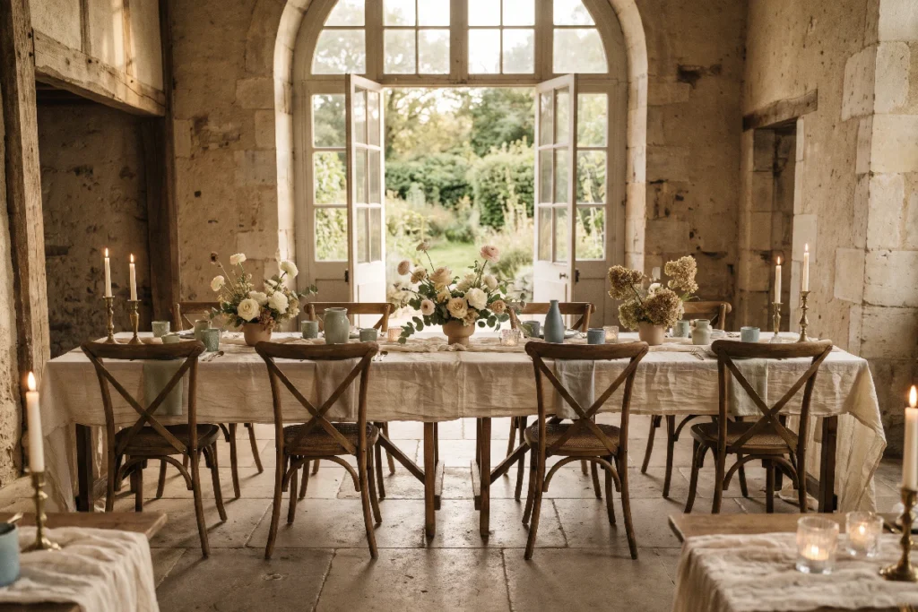
A wedding color palette can look beautiful on a moodboard and feel completely different once it enters a real space. The soft ivory that looked warm on a screen might disappear against pale stone walls. A deep green that seemed elegant in a garden setting could feel rather heavy in a room with dark wood and low ceilings.
That’s why choosing wedding colors is not just about finding shades you love. The venue is part of the picture from the beginning — its architecture, materials, existing colors, and light all influence how your palette will look on the day.
Start with the venue, not the color trends
It’s tempting to begin with a color you’ve saved, a seasonal trend, or a combination that looks particularly good on Pinterest. There’s nothing wrong with collecting inspiration, but it helps to see it in the context of the actual venue.
A palette that works beautifully in a sunlit garden may not do as well to a historic ballroom. And colors chosen for a bright coastal setting might feel out of place in a modern space with concrete floors and dark metal details.
Before settling on specific shades, spend some time looking at the venue itself. Pay attention to what is already there, what catches your eye, and what you would rather leave in the background. The goal isn’t to make the space look like something else. It’s to build on what makes it distinctive. Once you have a foundation, thoughtful accent colors can help introduce contrast and bring more depth to the overall look.
Consider the existing colors and materials
Walls, floors, furniture, ceilings, and architectural details all become part of your wedding’s visual backdrop. Even when they aren’t particularly noticeable on their own, they can influence how flowers, linens, stationery, and table decorations appear.
Look beyond the obvious colors. A room with cream walls might also have warm oak floors, brass fixtures, or stone details with subtle grey undertones. A garden venue may include dark wooden furniture, terracotta paths, or an abundance of greenery.
These materials can help guide your palette:
- Warm wood, brick, and terracotta tend to work naturally with earthy shades, muted greens, warm neutrals, and soft peach.
- Stone, marble, and cool grey surfaces can be complemented by dusty blue, sage, ivory, and softer pinks.
- Dark wood and rich architectural details often pair well with deeper greens, burgundy, muted gold, and warm cream.
- White walls and simple interiors offer more flexibility, allowing the palette to take a stronger visual role.
Pay Attention to Natural and Artificial Lighting
Lighting can change a color almost as much as the setting itself. A shade that looks soft and delicate in daylight may appear cooler in the evening, while warm artificial lighting can make some colors look richer or more yellow.
This matters particularly when choosing pale and muted tones. Ivory, champagne, blush, and beige are not interchangeable — and their undertones become much more noticeable under different lighting conditions.
Think about when and where the main parts of the celebration will take place:
- Bright natural daylight tends to reveal the true character of colors, although direct sun can make pale shades appear washed out.
- Golden-hour light adds warmth, which can make peach, cream, and muted pink feel especially soft.
- Warm indoor lighting can bring out yellow and golden undertones, while cooler lighting may make some neutrals look grey.
- Evening candlelight creates a softer, more intimate atmosphere, but very dark colors may lose some of their detail.
If possible, visit the venue at approximately the same time as your ceremony or reception. A room photographed at noon can look quite different at 7 p.m., especially once the candles are lit and the daylight starts to fade.
One useful trick: take photographs of the venue during your visit. Look at them alongside your inspiration images and notice whether the colors feel like they belong together. It’s a simple way to catch combinations that look lovely separately but less convincing side by side.
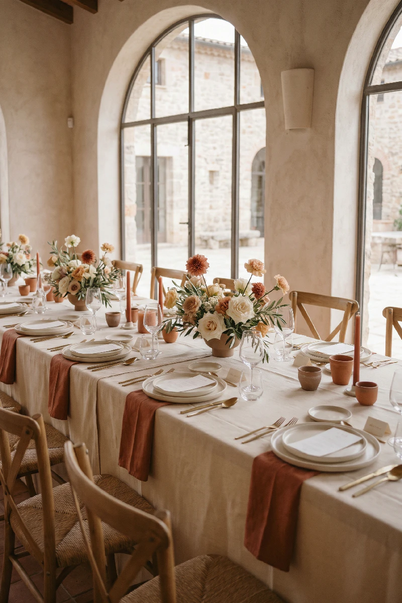
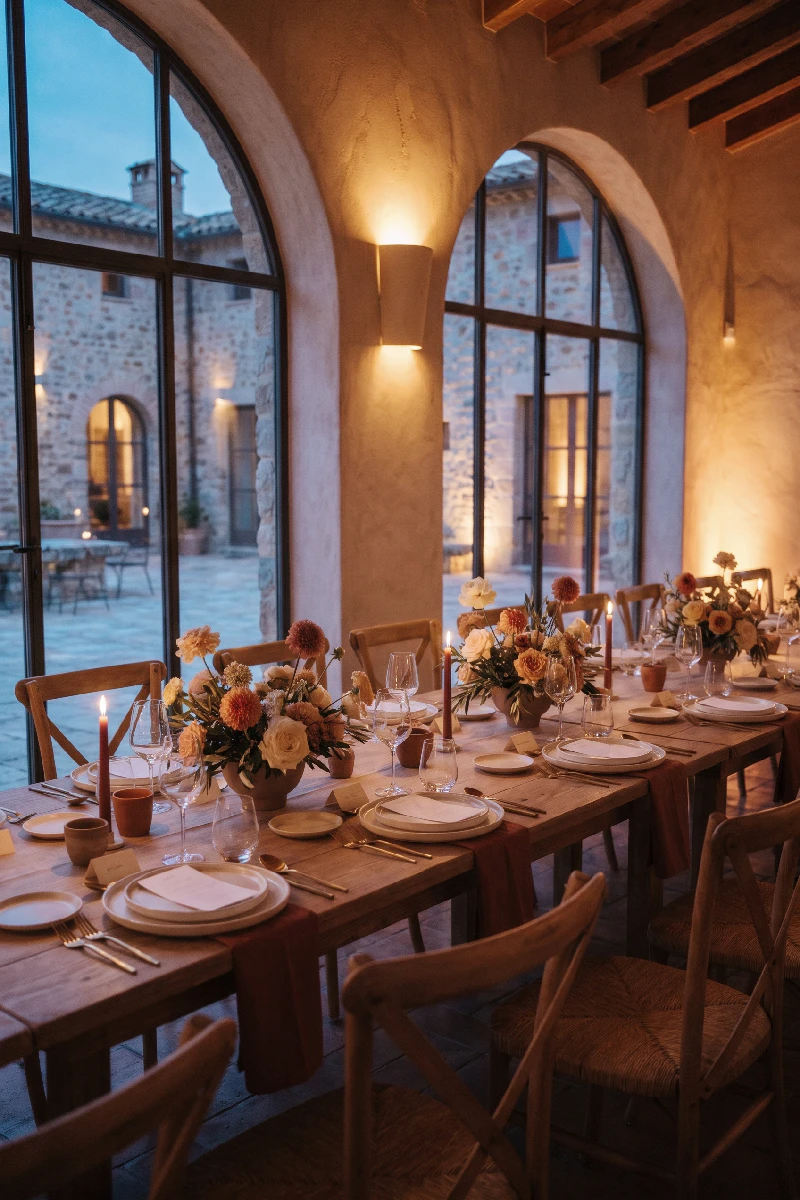
Matching Your Wedding Venue Color Palette to the Setting
Every venue has its own visual language. You don’t need to follow a strict formula, but certain color directions tend to feel especially natural in particular surroundings.
Historic Venues and Classic Architecture
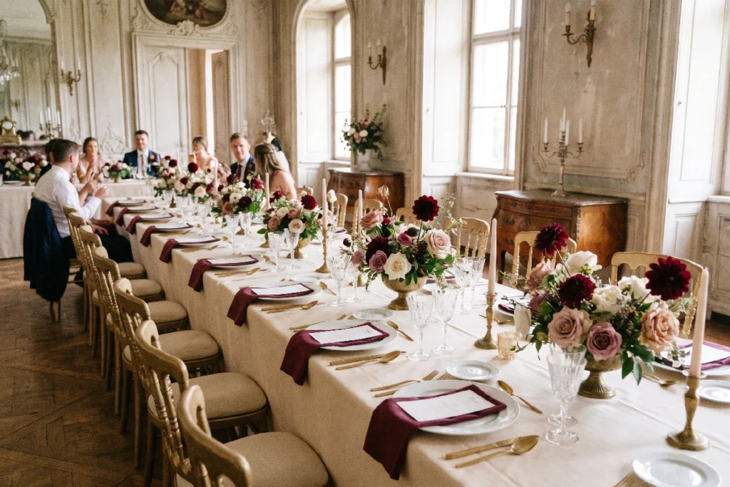
Historic buildings often come with plenty of character already: ornate ceilings, patterned floors, antique furniture, carved wood, and aged stone. A restrained palette usually lets these details do their work.
Ivory, soft champagne, dusty rose, muted sage, and deeper shades such as burgundy or forest green can sit comfortably alongside traditional architecture. For a more formal look, small touches of antique gold or warm brown can add depth without making the room feel overly decorated.
The key is to avoid competing with the architecture. If the venue already has elaborate details, the flowers and table settings don’t need to make an equally dramatic entrance.
Garden and Outdoor Weddings
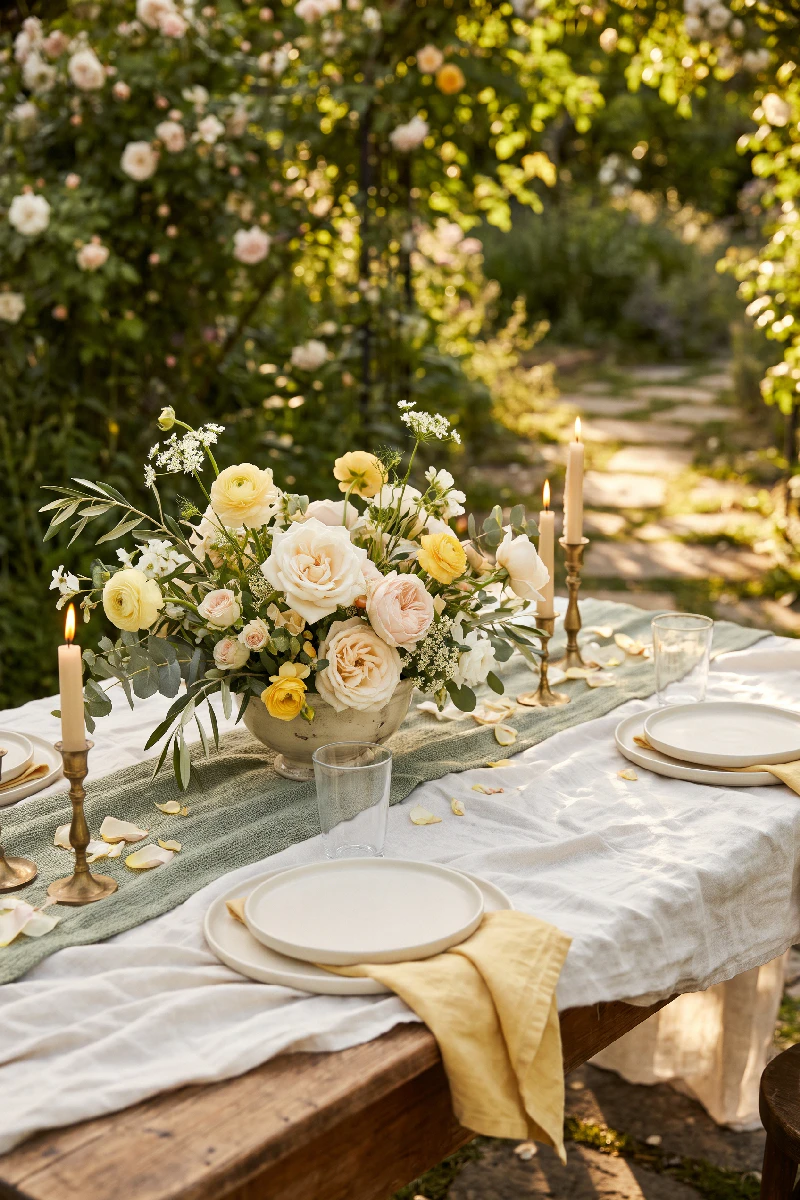
Outdoor settings provide a natural starting point: greenery, flowers, changing light, and the colors of the surrounding landscape.
Soft greens, butter yellow, blush, lavender, warm ivory, and muted peach can feel at home in a garden. For a more understated combination, consider pairing a few gentle shades with deeper botanical tones rather than trying to match every flower in the surroundings.
Also consider the season. A palette that feels fresh in a spring garden may look a little out of place against the deeper greens and warm foliage of late summer or autumn.
And remember that nature is not a perfectly coordinated backdrop. The grass, trees, flowers, and sky will all have their own colors. Your palette only needs to complement them, not match every leaf.
Coastal and Waterfront Venues
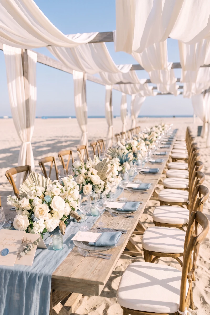
Coastal settings don’t automatically call for navy and white. In fact, a more nuanced palette can feel much more interesting.
Think of sandy beige, warm ivory, soft blue, sea-glass green, pale grey, and muted taupe. These shades echo the surroundings without turning the wedding into a literal seaside theme.
For a warmer look, add a little butter yellow or dusty peach. For something more classic, keep the palette restrained and let natural textures — linen, weathered wood, stone, and glass — add visual interest.
The particular setting matters, too. A bright beach venue with white interiors will feel different from a waterfront restaurant with dark timber and dramatic windows. The same colors won’t necessarily work in both.
Modern and Industrial Spaces
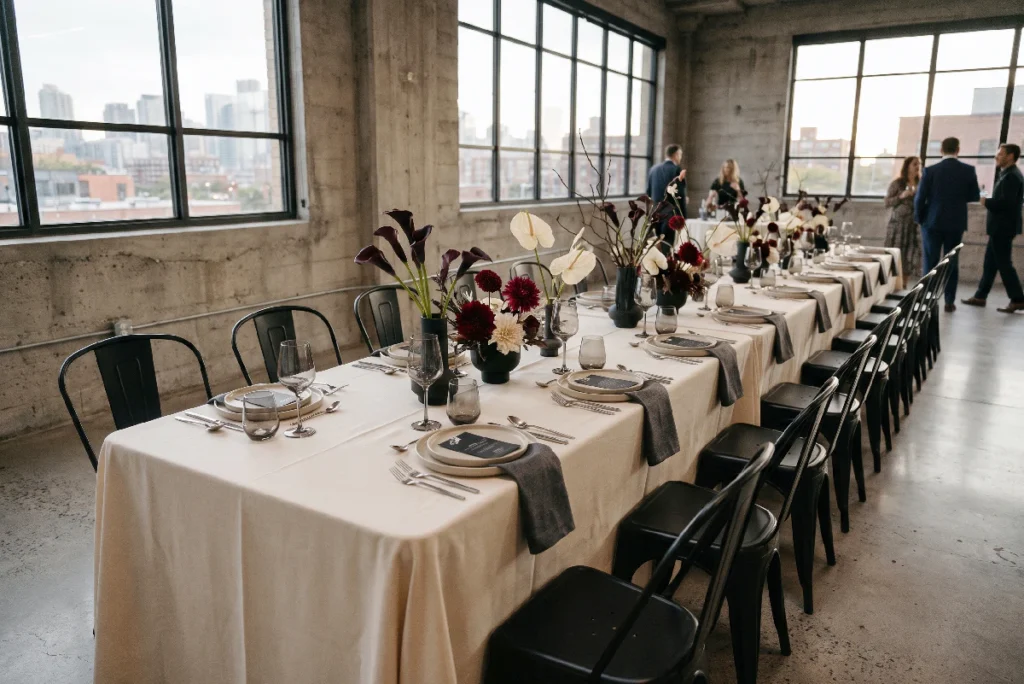
Contemporary venues often feature concrete, steel, glass, exposed brick, and clean architectural lines. These materials can support both minimal and more expressive palettes.
For a softer look, try warm ivory, taupe, muted blush, and sage. If you prefer more contrast, black, white, deep burgundy, or rich green can create a confident combination against a neutral architectural background.
In spaces with a lot of concrete or cool grey surfaces, warmer shades can prevent the overall look from feeling too cold. Conversely, a room with warm brick and timber may benefit from cooler accents to create a little balance.
When the Venue Has Strong Colors of Its Own
Some venues are not neutral — and that doesn’t mean you need to cover everything in flowers or linen to make your palette work.
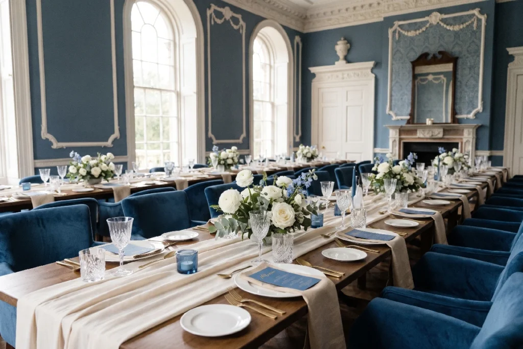
A room with blue walls, patterned wallpaper, colorful tiles, or distinctive upholstery already has a strong visual identity. Trying to ignore it can make the wedding decor feel disconnected from the space.
Instead, identify one or two existing colors and decide how you want to work with them. You might choose complementary shades, repeat a color in a more subtle form, or use neutrals to give the eye somewhere to rest.
For example, if a venue has deep blue walls, soft blue stationery or a few blue floral details can make the choice feel intentional. Ivory, warm beige, and muted green can then keep the overall palette balanced.
You don’t have to repeat the venue’s colors everywhere. Sometimes a small connection is enough.
Bringing Everything Together
Once you’ve considered the venue, its materials, and its lighting, you can start refining the palette itself. Think about the role each color will play rather than choosing several shades simply because they look good together.
A useful starting point is to select:
- A main color that sets the overall direction.
- One or two supporting shades that add variation and work with the surroundings.
- A neutral to give the palette breathing room.
- An accent color, if needed, for smaller details such as ribbons, stationery, or floral touches.
Then look at the palette in context. Place the colors next to photographs of the venue, consider how they’ll appear on table linens and flowers, and check how they look in both daylight and evening light.
The same shade can tell a different story depending on what surrounds it. A dusty blue might feel airy against white walls, romantic alongside old stone, or unexpectedly modern against concrete. The color hasn’t changed — the setting has.
And that’s the point. A thoughtful wedding palette doesn’t have to transform the venue. It should feel as though it belongs there.
More to Explore
- Charleston Welcome WeekendA thoughtfully curated welcome bag collection inspired by the quiet elegance of Charleston.
- What to Put in a Wedding Welcome Bag (and What to Skip)A wedding welcome bag helps guests feel at home from the moment they arrive. Discover what to include, and what to skip to keep the bag simple, practical, and well considered.
- How to Put Together a Thoughtful Holiday Gift BasketLooking for thoughtful holiday gift basket ideas? Learn how to choose a theme, pick the right gifts, and put together your Christmas gift basket.
- Bridal Morning Inspiration: The Quiet Hours Before the VowsA quiet, intimate look at the hours before the ceremony, with thoughtful bridal details, soft light, and understated morning elegance.
- How to Elevate Your Holiday Gift Wrapping: Minimalist Ideas & DetailsDiscover simple ways to make holiday gift wrapping feel more thoughtful with natural textures, understated details, personalized touches, and minimalist style.


