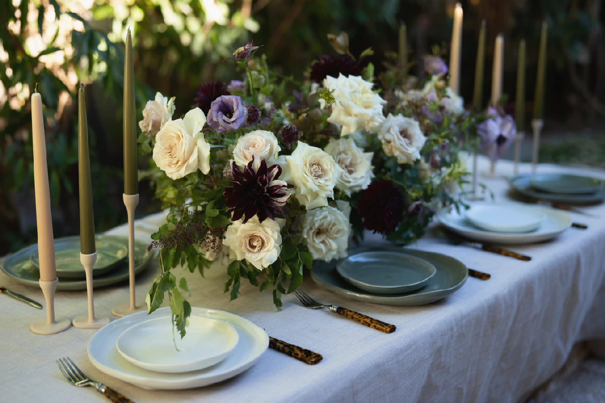
How to Use Accent Colors in Wedding Decor
A thoughtfully chosen wedding color palette provides a starting point, but it is the smaller details that often bring it to life. Without variation, even a beautiful combination of shades can feel a little flat when translated into actual decorations.
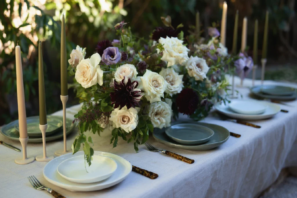
Accent colors help solve this by adding contrast, depth, and visual interest without changing the overall character of the palette.
The key is knowing where and how to introduce them. An accent color does not need to appear everywhere or compete with the main shades. Sometimes a few carefully placed details are enough to make the entire design feel more complete.
What Is an Accent Color in Wedding Decor?
An accent color is an additional shade used to highlight certain elements within a wedding color palette. While the primary colors establish the overall look and atmosphere, accent shades add variation and help draw attention to specific details.
An accent color can be noticeably different from the main palette, creating contrast, or it can be a softer variation of an existing shade. For example, a combination of ivory and mocha can feel warmer and more dimensional with touches of muted blue, while a palette of sage and cream might benefit from a little terracotta.
There is no strict rule about how many accent colors to use. One additional shade may be enough, while a more layered palette can accommodate two. What matters is that each color has a purpose and contributes to the overall visual direction.
How to Choose Accent Colors for Your Wedding Palette
The easiest way to choose an accent color is to start with the combination you already have. Rather than introducing an entirely new direction, look for a shade that complements the venue and the existing colors and adds something they are missing.
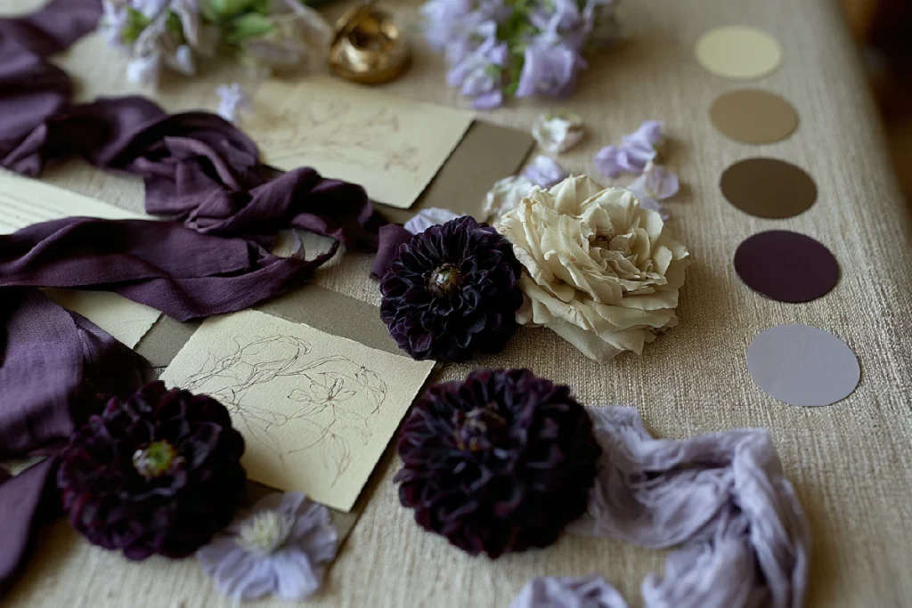
Consider these approaches:
- Create contrast. If your palette is mostly soft and neutral, a deeper shade such as burgundy, navy, or forest green can add definition. Even in small amounts, a darker color can make lighter tones feel more pronounced.
- Stay within the same color family. A slightly warmer, cooler, lighter, or deeper variation of one of your main shades can create subtle dimension without introducing a strong contrast.
- Look at color temperature. Warm and cool undertones influence how colors interact. A muted blue can balance warm ivory and beige, while a soft peach can bring warmth to a palette built around sage and gray.
- Consider the setting. Your venue, natural surroundings, lighting, and existing materials all influence how a color will look. A shade that works beautifully in a bright garden may feel quite different in a dimly lit ballroom.
For example, a palette of ivory, mocha, and muted blue can feel understated and elegant, with blue appearing in a few carefully selected details. Sage, cream, and terracotta create a warmer impression, while blush, burgundy, and soft peach offer a more romantic combination with a little depth.
The goal is not to add another color simply for variety, but to find one that makes the existing palette more interesting.
Where to Use Accent Colors in Wedding Decor
Once you have chosen your accent shades, think about where they will have the greatest visual impact. You do not need to distribute them evenly throughout the venue. In fact, selective placement often creates a more natural and sophisticated result.
Ceremony decor
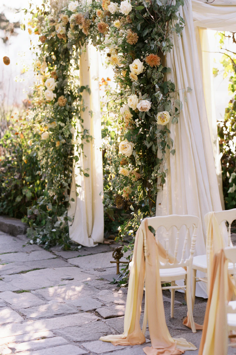
The ceremony offers several opportunities for introducing subtle color. Consider ribbons tied around aisle chairs, floral arrangements, or small details incorporated into the ceremony backdrop. An accent shade can also appear in the fabric used to decorate an arch or in the flowers surrounding the seating area.
Reception tables
Table settings are particularly effective for introducing accent colors because they contain many smaller elements that can be combined in different ways. Colored napkins, taper candles, glassware, menu cards, and place cards can all contribute to the overall look.
For a mostly neutral table, a few burgundy candles or muted blue napkins may be enough to create contrast without overwhelming the setting.
Wedding stationery
Stationery is another natural place for accent colors. Colored envelopes, envelope liners, printed details, ribbon closures, and subtle typography variations can carry the palette from the ceremony to the reception.
These details also help create a visual connection between the invitations and the rest of the wedding decor.
Floral arrangements
Flowers can introduce accent colors in a particularly organic way. Instead of choosing arrangements made entirely from the main palette, consider adding a few blooms in a contrasting shade or incorporating seasonal flowers with slightly different undertones.
The greenery, branches, and natural textures within an arrangement can also contribute additional variations without making the color scheme feel too busy.
Use Metallics as an Unexpected Accent
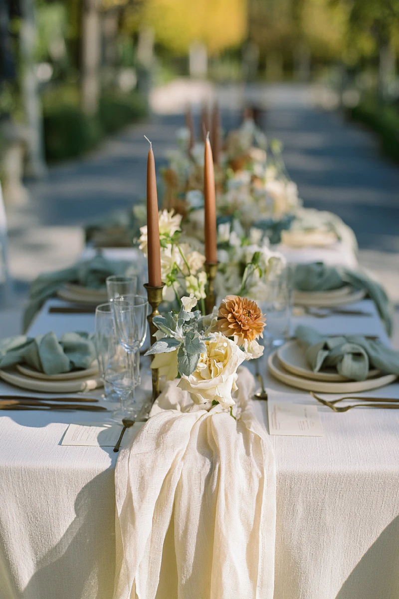
Accent colors do not always have to come from the traditional color wheel. Metallic finishes can play a similar role, adding contrast, warmth, or a subtle reflective quality to the overall design.
Gold, silver, bronze, and champagne each create a different impression. Gold and champagne bring warmth to neutral and earthy palettes, silver works particularly well with cooler shades, while bronze adds depth to combinations built around brown, terracotta, and muted greens.
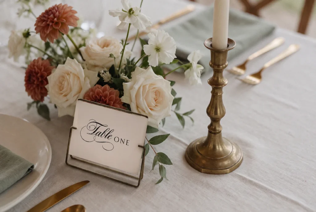
Photo by WOWwedsstudio
There are several ways to incorporate metallic accents:
- Table details: gold or silver cutlery, metallic candle holders, chargers, and small decorative objects.
- Stationery: foil lettering, metallic borders, wax seals, or delicate gold and silver details on menus and place cards.
- Decorative elements: brass candlesticks, metallic frames, small trays, and understated table accessories.
- Finishing touches: metallic ribbon, subtle foil details, or reflective surfaces incorporated into the reception styling.
The important thing is to consider metallics as part of the palette rather than treating them as a separate decorative category. A little gold can warm up an ivory and mocha combination, while silver can give a palette of dusty blue and soft gray a more refined finish.
You can also introduce accents in less expected ways. Think of colored glassware, contrasting ribbon tails on bouquets, a different shade on the reverse side of menus, or a colored envelope liner that is revealed only when the invitation is opened.
These small surprises are often more memorable than larger decorative elements because they reward a closer look.
How to Balance Accent Colors Without Overdoing Them
One of the easiest ways to lose the effect of an accent color in wedding decor is to use it too frequently. When every element competes for attention, it becomes difficult to distinguish the main palette from the supporting details.
A more effective approach is to think about visual hierarchy. Let the primary colors establish the overall atmosphere, then use accent shades selectively to highlight particular areas.
A few principles can help:
- Choose focal points. Decide which elements should carry the strongest accents, such as the reception tables, floral arrangements, or stationery.
- Repeat colors thoughtfully. If a particular shade appears in the table linens, consider echoing it in the flowers or stationery. Repetition creates continuity, even when the elements are not identical.
- Leave room for neutrals. Ivory, cream, beige, and other understated tones give stronger colors space to stand out.
- Vary the intensity. An accent color does not need to appear in the same saturation everywhere. A deeper shade in one element and a softer variation in another can create a more layered effect.
The balance does not have to be mathematical. What matters is how the colors work together when viewed across the entire space.
Let Textures and Materials Add Another Layer
Color is only one part of the visual experience. The same shade can look completely different depending on the material it appears on.
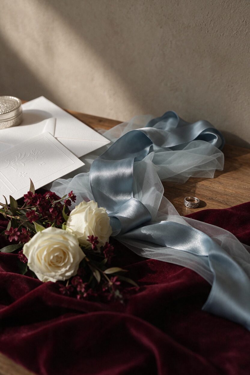
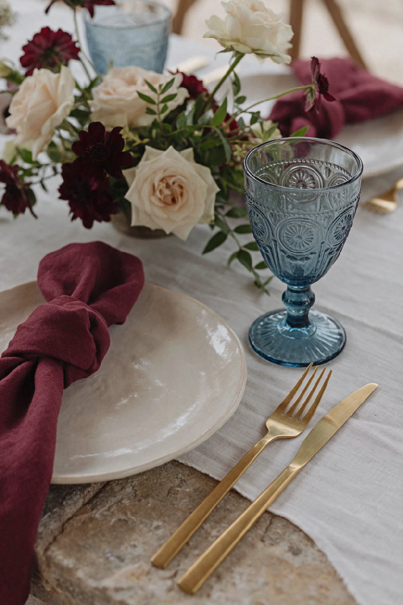
A muted blue on silk ribbon has a soft, delicate quality, while the same color in textured glassware may feel more contemporary. Burgundy velvet introduces richness and depth, whereas burgundy flowers create a more natural and romantic impression.
Think about how different materials can support your accent colors:
- Silk and velvet: bring softness, depth, and a richer appearance to a shade.
- Glass and ceramics: introduce color through translucent, reflective, or tactile surfaces.
- Natural materials: wood, stone, linen, and dried botanicals create a more organic interpretation of the palette.
- Paper and fabric: offer opportunities to introduce subtle variations through texture, printing, and finishing details.
Sometimes, adding another material in an existing accent shade is more effective than introducing an entirely new color. This creates visual interest while keeping the overall palette cohesive.
Bring Your Wedding Color Palette Together
Accent colors in wedding decor are most effective when they feel like a natural extension of the wedding palette rather than decorations chosen independently. Whether you introduce a contrasting shade, a metallic finish, or an unexpected detail, each element should contribute to the same overall visual direction.
Start with a clear combination of primary colors, then look for opportunities to add depth through carefully placed accents, varied materials, and thoughtful repetition. You do not need many additional elements to make a difference.
Often, it is the smallest details that make a wedding design feel considered, cohesive, and uniquely its own.
More to Explore
- Bridal Morning Inspiration: The Quiet Hours Before the VowsA quiet, intimate look at the hours before the ceremony, with thoughtful bridal details, soft light, and understated morning elegance.
- Charleston Welcome WeekendA thoughtfully curated welcome bag collection inspired by the quiet elegance of Charleston.
- How to Elevate Your Holiday Gift Wrapping: Minimalist Ideas & DetailsDiscover simple ways to make holiday gift wrapping feel more thoughtful with natural textures, understated details, personalized touches, and minimalist style.
- How to Put Together a Thoughtful Holiday Gift BasketLooking for thoughtful holiday gift basket ideas? Learn how to choose a theme, pick the right gifts, and put together your Christmas gift basket.
- How to Use Accent Colors in Wedding DecorDiscover how to use accent colors in wedding decor to add depth, contrast, and visual interest to your wedding color palette. Explore ideas for incorporating accent shades, metallic details, flowers, stationery, and textures to create a cohesive and beautifully balanced wedding design.


